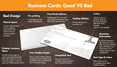
(Do's and Don't of business card design)
(Template Used)
(Business Card Research)
With the logo and mascot designs worked out I began to work on the Business card. An important part of a business card is the Typography design. Typography is the art and craft of arranging letters and words. The layout, colouring and sizing are all taken into consideration and follow a theme. This art form evolved into having simple graphic art included in the design and was used to create "info-graphic" posters. These posters were used by businesses to get a message across to a customer in the most interesting but simple way possible. That it was I want to achieve with the business card.

(Do's and Don't of typography)
I then looked at colour theory. I wanted them to follow the theme of animation and me as an artist so I decided to go with Blue to represent the blue animation pencil I use for drawing. Then I picked a vibrant Pink, Green and Orange. This is because I use highlighters to add tone and lighting to my drawings which stands out to people. I also got some reference that fit more in line with the design I had in mind and put them together on an Idea board to help me visualize the design.
(Idea Board)


No comments:
Post a Comment